 "ttyymmnn" (ttyymmnn)
02/14/2014 at 16:51 • Filed to: kinja help
 4
4
 100
100|
"ttyymmnn" (ttyymmnn)
02/14/2014 at 16:51 • Filed to: kinja help | 4
| 100 |
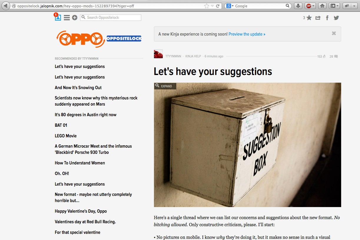
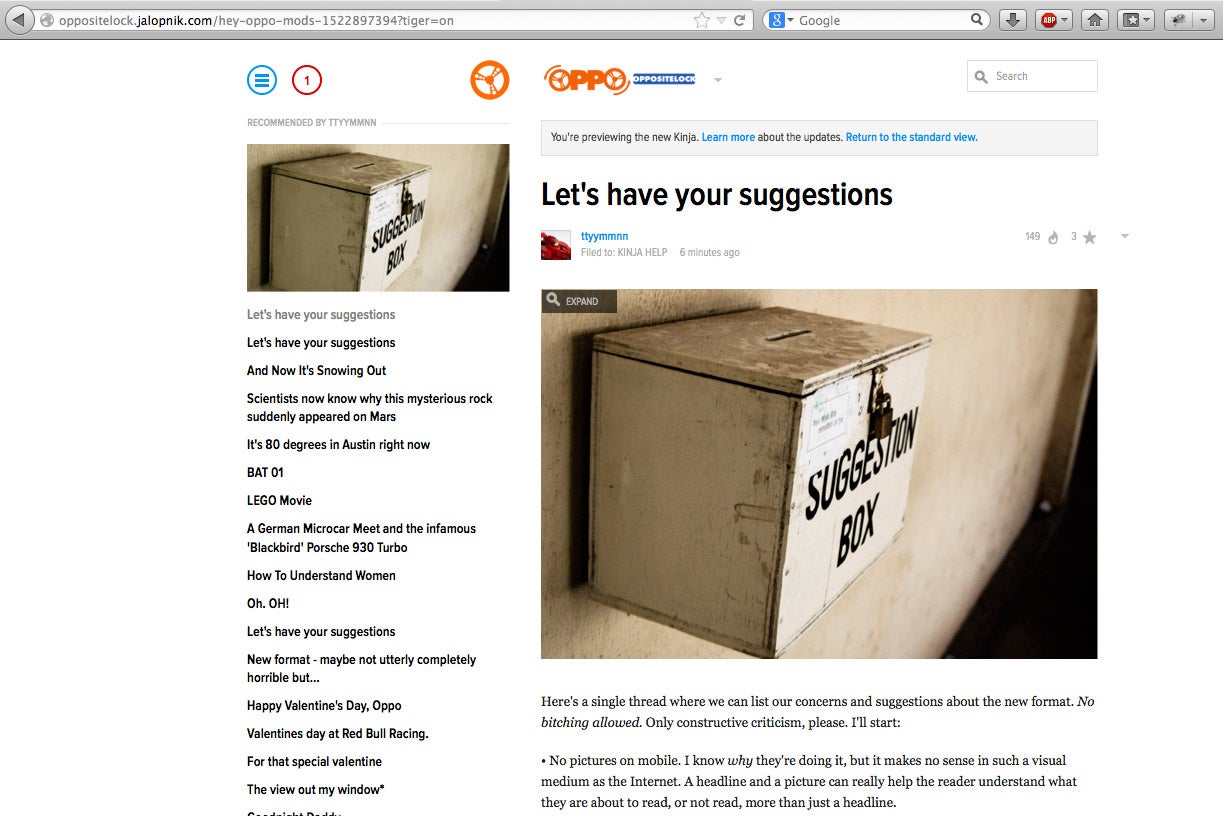
Here's a single thread where we can list our concerns and suggestions about the new format. No bitching allowed. Only constructive criticism, please. I'll start:
• No pictures on mobile. I know why they're doing it, but it makes no sense in such a visual medium as the Internet. A headline and a picture can really help the reader understand what they are about to read, or not read, more than just a headline.
• Some sort of explanation on how to navigate replies/comments. The !!!error: Indecipherable SUB-paragraph formatting!!! is nice, but it doesn't really explain how things work.
!!! UNKNOWN CONTENT TYPE !!!
• Can the number of recommendations show up on replies without a mouse over? It's good to know which comments have received a lot of recommendations without having to go hunting, as these are often stronger comments.
 Gamecat235
> ttyymmnn
Gamecat235
> ttyymmnn
02/14/2014 at 11:57 |
|
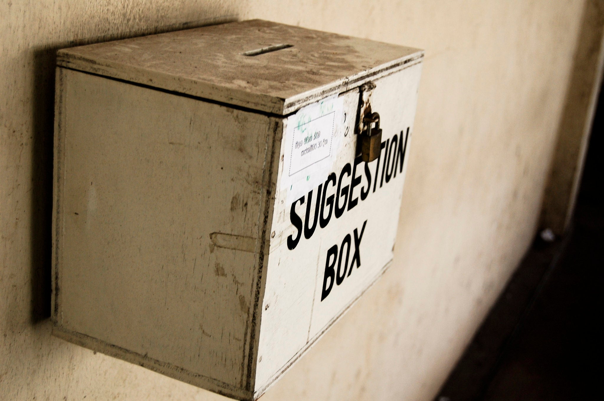
Do it. Throw in a Suggestions Here image and let's bump it a few times. I want to keep all of the constructive feedback in one or a few easy places for Ernie, Steve, Greg, Lauren and crew to be able to digest and pass it along so that our voices are heard. I like what you're saying, and the no pictures on mobile is absurd .
ETA: for clarification, I'm saying, you're already starting one, let's use this as the place.
 Party-vi
> ttyymmnn
Party-vi
> ttyymmnn
02/14/2014 at 11:59 |
|
I don't know what the issues is I love the new system.
*takes fat check from Hardibro*
 $kaycog
> ttyymmnn
$kaycog
> ttyymmnn
02/14/2014 at 12:04 |
|
I agree with you. As of now, the comments/replies section is my only concern.
|
ttyymmnn
> Gamecat235
02/14/2014 at 12:06 |
|
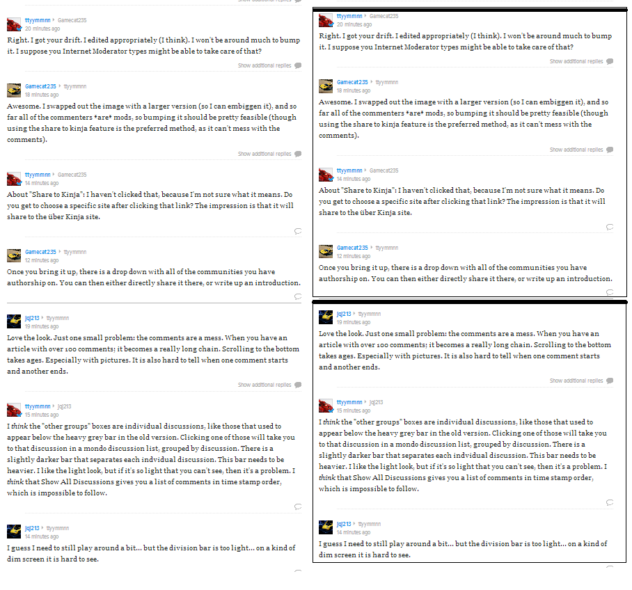
Right. I got your drift. I edited appropriately (I think). I won't be around much to bump it. I suppose you Internet Moderator types might be able to take care of that?
 JQJ213- Now With An Extra Cylinder!
> ttyymmnn
JQJ213- Now With An Extra Cylinder!
> ttyymmnn
02/14/2014 at 12:07 |
|
Love the look. Just one small problem: the comments are a mess. When you have an article with over 100 comments; it becomes a really long chain. Scrolling to the bottom takes ages. Especially with pictures. It is also hard to tell when one comment starts and another ends.
|
Gamecat235
> ttyymmnn
02/14/2014 at 12:08 |
|
Awesome. I swapped out the image with a larger version (so I can embiggen it), and so far all of the commenters *are* mods, so bumping it should be pretty feasible (though using the share to kinja feature is the preferred method, as it can't mess with the comments).
 505Turbeaux
> ttyymmnn
505Turbeaux
> ttyymmnn
02/14/2014 at 12:08 |
|
yeah the pics strip out on smaller tablet resolution and below in the responsive design. Mod recco pics that are blown up still show though. I wonder if it is a perceived user end bandwidth concern to do so. I am digging a bit more into it today to come up with bugs etc. Gamecat had a thread yesterday I was going to bump
!!! UNKNOWN CONTENT TYPE !!!
|
ttyymmnn
> JQJ213- Now With An Extra Cylinder!
02/14/2014 at 12:11 |
|
I think the "other groups" boxes are individual discussions, like those that used to appear below the heavy grey bar in the old version. Clicking one of those will take you to that discussion in a mondo discussion list, grouped by discussion. There is a slightly darker bar that separates each indvidual discussion. This bar needs to be heavier. I like the light look, but if it's so light that you can't see, then it's a problem. I think that Show All Discussions gives you a list of comments in time stamp order, which is impossible to follow.
|
JQJ213- Now With An Extra Cylinder!
> ttyymmnn
02/14/2014 at 12:12 |
|
I guess I need to still play around a bit... but the division bar is too light... on a kind of dim screen it is hard to see.
|
ttyymmnn
> Gamecat235
02/14/2014 at 12:12 |
|
About "Share to Kinja": I haven't clicked that, because I'm not sure what it means. Do you get to choose a specific site after clicking that link? The impression is that it will share to the über Kinja site.
|
Gamecat235
> ttyymmnn
02/14/2014 at 12:14 |
|
Once you bring it up, there is a drop down with all of the communities you have authorship on. You can then either directly share it there, or write up an introduction.
 PRBot II
> ttyymmnn
PRBot II
> ttyymmnn
02/14/2014 at 12:17 |
|
Here is a group discussion which is easy to understand:
And now here is the same group discussion in a more complicated format:

 Jayhawk Jake
> ttyymmnn
Jayhawk Jake
> ttyymmnn
02/14/2014 at 12:32 |
|
I have two recommendations for comments
One would be to leave it in the older style with two columns of discussions, but I realize that would be difficult. Although it appears to just duplicate comments into the two columns? I have no idea, which highlights the issue: it makes no damn sense
The other recommendation would be easier to implement: box discussions. Right now it's just a white mess of text and there's no de-lineation, it's almost impossible to follow.
Left is what it is, right is what it should be. This was a two second MS paint edit, I envision being similar to comments now: author, number of replies/recommendations in a grey box at the top, the outline encompasses replies, white space between threads
 Desu-San-Desu
> ttyymmnn
Desu-San-Desu
> ttyymmnn
02/14/2014 at 12:45 |
|
I'm okay with everything (much of it is an improvement) except for the structure of the comments section. I think the 'active' Group thread should be shrunk a little bit to maybe 3 or 4 commets, with the old option to 'expand thread' at the bottom. I also don't like know how images and videos don't have a preview or thumbnail in the smaller side-by-side group stacks.
|
ttyymmnn
> ttyymmnn
02/14/2014 at 14:10 |
|
Here's another one: Pictures in the "Other Groups" section. If the reply is only a photo, which is pretty common, it shows up simply as a blank square.
 BJ
> ttyymmnn
BJ
> ttyymmnn
02/14/2014 at 14:11 |
|
Please put the tags back on the post summaries. Not only do they help show the category (duh!) but provide a quick link to see other posts tagged the same way, without having to open the first post.
 PushToStart
> ttyymmnn
PushToStart
> ttyymmnn
02/14/2014 at 14:15 |
|
Yeah, as it's been said before, the comments section needs work. I'm not sure of the whole situation on desktop because I haven't seen it there, but on mobile it's difficult to tell what the different threads are, it just looks like one continuous stream. Also, if there isn't an upload picture capability on mobile, that needs to change. I use it all the time, many of my posts, in fact, are on mobile. But as far as the rest of it goes, I think it looks pretty decent!
 Racescort666
> PRBot II
Racescort666
> PRBot II
02/14/2014 at 14:28 |
|
Agreed, this is super confusing. Also, one of the things that would be helpful is the cursor going immediately to the text box when you click on the reply button.
|
Racescort666
> ttyymmnn
02/14/2014 at 14:37 |
|
The main page stuff looks and works great for site navigation and notifications and stuff. The comments are super hard to navigate.
I agree that recommendations showing up without a mouse over would be better. Not trying to sound too bad but it works as a bit of an "idiot test." 1 really dumb comment with no recommendations, the next one having 20 helps to spot good responses and know that all is not lost in the world.
Maybe as a clarification, there are not pictures in the main screen for mobile but when you click on the article, they show up. It would be nice to see the main pictures before clicking on an article.
 CobraJoe
> ttyymmnn
CobraJoe
> ttyymmnn
02/14/2014 at 14:44 |
|
I agree with most comments here: The comment section needs work.
The current system of showing the first 3 approved comments in a thread with the option to expand to full size works great. Also, having the comments split into 2 columns is pretty nice too to help keep from unnecessary scrolling.
So, biggest gripes about the new system: You only see the first comment, and there is a lot of empty space at the top and bottom of each comment, probably more noticeable because most people comment with a sentence or two, which doesn't really require full screen width.
 McMike
> ttyymmnn
McMike
> ttyymmnn
02/14/2014 at 14:58 |
|
Sorry, I didn't see the part of your text that asked for "no bitching".
I have been trying to use the new Kinja for a few days, and that's all I had.
|
ttyymmnn
> McMike
02/14/2014 at 15:03 |
|
Not necessarily. I think that when you click a discussion box in "other groups" it takes you to that discussion in a long list of discussions that are separated by an ever-so-slightly darker grey line. You can scroll up and down here and view complete discussions, like the old way when they were separated by a heavy grey bar, just all in one column. If you click "show all comments" (or whatever it's called) you get YouTube.
 Ernie @ Kinja
> ttyymmnn
Ernie @ Kinja
> ttyymmnn
02/14/2014 at 16:31 |
|
Hey, keep the feedback coming. We're corralling everything and implementing a lot of the fixes to the discussions that really bothered you guys over the first few days. Obviously we won't be able to address every nitpick, but hopefully most.
|
ttyymmnn
> Ernie @ Kinja
02/14/2014 at 16:47 |
|
Thanks for listening. I'm going to keep bumping this up for folks to add to it. For the most part, Oppo seems pretty pleased with things. Have a great weekend, though I imagine you might be working....
Cheers.
 willkinton247
> ttyymmnn
willkinton247
> ttyymmnn
02/14/2014 at 16:52 |
|
I like the grey background before, it's much easier to look at.
 f86sabre
> ttyymmnn
f86sabre
> ttyymmnn
02/14/2014 at 16:54 |
|
Comments need help. I sent in a help item on when you reply to an item the text box being blacked out on an ipad.
 desertdog5051
> ttyymmnn
desertdog5051
> ttyymmnn
02/14/2014 at 16:55 |
|
I'm not having any issues with it.
|
ttyymmnn
> f86sabre
02/14/2014 at 16:56 |
|
Yesterday, Ernie said that mobile editor and mobile notifications would be fixed today. Today isn't over yet! I'm still using the old version on my phone.
 Takuro Spirit
> ttyymmnn
Takuro Spirit
> ttyymmnn
02/14/2014 at 16:58 |
|
The comments are fine so long as they are promoted/up near the top. Once you use "View all XXX Discussions" it turns into a shit show. No way to tell who is replying to who at what time.
Some images do not show up in the Other Groups until expanded.
Just because I expand a post does not mean I want to reply to it. That window can GTFAC.
Having a smaller image of the image in the post I'm reading in the left toolbar is distracting and silly.
Seeing that people are allowed to troll the FP and add "related" posts is annoying too. That needs to be taken down.
Other than that..... it's not bad. Been using it exclusively since yesterday and am managing okay, except for trying to follow comment threads.
|
ttyymmnn
> desertdog5051
02/14/2014 at 16:58 |
|
The vast majority of beefs has been about the new commenting system. It doesn't seem to affect Oppo that much, moreso on Jalopnik and other sites that get hundreds of replies. I think I've figured out how the new system works, but I'm not certain yet.
 MIATAAAA
> ttyymmnn
MIATAAAA
> ttyymmnn
02/14/2014 at 16:58 |
|
I'm not sure, in the comments area, why some are included under the "other groups" heading.
And the chain of comments above that section are really big. I like being able to see a lot of comments very quickly.
 oldirtybootz
> ttyymmnn
oldirtybootz
> ttyymmnn
02/14/2014 at 17:00 |
|
No pictures on mobile is a huge turn off for me. I only use my phone for any web browsing, so I only use Kinja mobile.
The commenting seems to be confusing. Tree metaphors don't help so I could perhaps use some clarification there.
Do notifications show up in the blue circle at the top left or do you have to use that drop down menu to go to your notification page? If it's the latter, that will be a huge waste of time and data for me.
 Christopher Keach
> ttyymmnn
Christopher Keach
> ttyymmnn
02/14/2014 at 17:02 |
|
Here's a weird thing that's happening for me with OS X 10.7.5 and Firefox 26.0 - everything is smaller in the new version. This doesn't happen in Chrome.
 Jeff-God-of-Biscuits
> ttyymmnn
Jeff-God-of-Biscuits
> ttyymmnn
02/14/2014 at 17:02 |
|
reposting one of my gripes:
It would be nice to have the "expand all comments" at the top of the page, so that you don't have to scroll all the way down to click the button, scroll all the way back up, so that you can start to scroll down and read them. The only thing that is going to happen is that comments will not get expanded, and comments passed over.
|
ttyymmnn
> oldirtybootz
02/14/2014 at 17:02 |
|
Yesterday, Ernie said mobile notifications is on their punchlist. So, I'm assuming that they simply don't work yet, and will likely be part of the blue circle, when it gets fixed.
|
desertdog5051
> ttyymmnn
02/14/2014 at 17:02 |
|
I have seen a lot of stuff about mobile. I rarely use mobile for anything internet based and I don't post from it.
 Dunnik
> ttyymmnn
Dunnik
> ttyymmnn
02/14/2014 at 17:03 |
|
My suggestion is...to divorce Kinja and have Jalopnik/Oppo and its associated websites go it alone.
|
ttyymmnn
> desertdog5051
02/14/2014 at 17:04 |
|
Yes, but there are many users who only use their mobile. So confusing comments, no notifications, and lack of images is a huge problem. But I agree, the desktop experience is pretty good. I'm hoping BJ makes another script so we can have big pictures again. I hate the tiny thumbnails.
|
ttyymmnn
> Dunnik
02/14/2014 at 17:06 |
|
That was discussed back when Kinja first went live. There is a group on Google+, called Oppo+ (I believe), but I don't think it ever really caught on. I don't think everybody is ready to leave here en masse, and having somebody else to moderate and handle the tech issues is a huge plus.
 twinturbobmw
> ttyymmnn
twinturbobmw
> ttyymmnn
02/14/2014 at 17:08 |
|
I'm not really sure where all the hate is coming from. I quite like the update, although I do have one problem. You might have heard me mention this before, but I would like to see a better way of separating comments/discussions. Like right now we have this big gray bar that says "Author is participating." In the update it's just a small line so it's quite hard to tell whether it's a separate comment or a reply.
|
oldirtybootz
> ttyymmnn
02/14/2014 at 17:11 |
|
On the current Kinja, I get logged out all the time(I sign in through Twitter). With the new Kinja, it wouldn't allow me to sign in unless I switched to the current format. I'm hoping this will also be fixed or I guess I have to create a new account.
 deekster_caddy
> ttyymmnn
deekster_caddy
> ttyymmnn
02/14/2014 at 17:11 |
|
The only thing I'm missing is a 'jump to Oppo' from the FP. Jump to FP has been missing from Oppo for a while. Not a deal breaker, I have bookmarks, but I use that little link from the FP all the time.
You guys are already talking about the notification numbers, so I have nothing to add there.
Edit - I don't know why I wasn't seeing it before, but now I see the big TITLE WITH ARROW that lets you jump to and from the sub-sites and FP. So never mind.
I can adjust to the endless scrolling, but the 'click to expand this branch' has it's merits.
|
ttyymmnn
> twinturbobmw
02/14/2014 at 17:13 |
|
Actually, there has been surprisingly little hate. Comments are the biggest concern, and that is being addressed . How they adjust it remains to be seen.
!!! UNKNOWN CONTENT TYPE !!!
 Joe_Limon
> ttyymmnn
Joe_Limon
> ttyymmnn
02/14/2014 at 17:15 |
|
I am sure this is posted numerous times already but... mobile is a mess... black text boxes and the inability to switch between main pages or view notifications? I simply cannot use it even if I try.
|
ttyymmnn
> deekster_caddy
02/14/2014 at 17:16 |
|
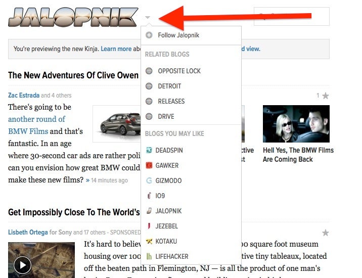
Have you tried clicking the tiny little gray triangle next to the Jalopnik logo?
|
deekster_caddy
> ttyymmnn
02/14/2014 at 17:16 |
|
Yeah, literally just edited. Don't know why I didn't notice it before, but that's perfect.
|
ttyymmnn
> Joe_Limon
02/14/2014 at 17:18 |
|
Try switching back to the old version of mobile. Everything still works there. I'm sure they'll eventually kill it, but it's working for now.
|
Joe_Limon
> ttyymmnn
02/14/2014 at 17:21 |
|
Oh yes, the old version works, I was simply commenting on the new version being absolutely useless.
|
ttyymmnn
> Joe_Limon
02/14/2014 at 17:22 |
|
Yup, it pretty much is. I think it's pretty high on their punch list.
 Tom McParland
> Dunnik
Tom McParland
> Dunnik
02/14/2014 at 17:22 |
|
I looked into Oppo+ on Google...yes it is not a Kinja mess but I don't think it is as fun.
 TheBloody, Oppositelock lives on in our shitposts.
> ttyymmnn
TheBloody, Oppositelock lives on in our shitposts.
> ttyymmnn
02/14/2014 at 17:23 |
|
No pictures on mobile!?! What was the reasoning behind it and now what am I going to do when I'm on the train coming home every day? Oppo is 90% of my commuting entertainment.
|
ttyymmnn
> ttyymmnn
02/14/2014 at 17:24 |
|
The invisible tags are a bad thing. If I go to Jalopnik to look for COTD, I have no idea which post it is.
|
ttyymmnn
> TheBloody, Oppositelock lives on in our shitposts.
02/14/2014 at 17:26 |
|
The rationale is that it was done "to improve performance." I wouldn't hold my breath waiting for their return. In Oppo, any images that get promoted, which means those that get embiggened, will appear on mobile. All the others will not. Jalopnik gets the same treatment.
|
Gamecat235
> f86sabre
02/14/2014 at 17:30 |
|
Reported that directly to Nick Denton a bit more than a week ago...
http://product.kinja.com/thank-you-for-…
|
TheBloody, Oppositelock lives on in our shitposts.
> ttyymmnn
02/14/2014 at 17:33 |
|
I know we're not supposed to bitch, but I'm calling bull shit. Especially with today's mobile device capabilities. I'm truly disappointed with kinja's dev team.
|
ttyymmnn
> TheBloody, Oppositelock lives on in our shitposts.
02/14/2014 at 17:36 |
|
Gawker has an unfortunate history of rolling out site changes that aren't quite ready for prime time. They turn us all into beta testers, basically. In the interim, you can still use the old mobile site, which works as it always did. Better, really, since you still get pictures. I expect that most of the major mobile issues will be ironed out soon. At least I hope so.
|
TheBloody, Oppositelock lives on in our shitposts.
> ttyymmnn
02/14/2014 at 17:49 |
|
Yeah don't I know it, this just screams "project manager with zero dev background and refuses to listen to his/her dev team". That or it is just all contractors in either Eastern Europe or India.
|
f86sabre
> Gamecat235
02/14/2014 at 17:57 |
|
It's the weird color-scheme that freaks me. Every time you try to operate one of these weird black controls, which are labeled in black on a black background, a small black light lights up in black to let you know you've done it!
 Sn210
> ttyymmnn
Sn210
> ttyymmnn
02/14/2014 at 18:00 |
|
I've noticed a couple of things that bug me in mobile (iOS)...
The bigger concern I have is that I can't tap the top of my browser to jump back to the top. I can do this with the current version and I use it all the time.
The other issue is with the comments section. I hit "show more replies" and it opens a box for me to write my own comment.
The lack of pictures is also a let down, I only use my phone and iPad to Oppo and looking at pictures others post is what I like to do best.
|
Gamecat235
> f86sabre
02/14/2014 at 18:06 |
|
Yeah, it's gotten worse. I've stopped using mobile in the new view and avoided VW and Joel and other areas that have it by default.
|
Ernie @ Kinja
> ttyymmnn
02/14/2014 at 18:13 |
|
Never thought I'd see the day when Oppo is "pretty pleased" with a design change.. It's.. Beautiful.
|
ttyymmnn
> Sn210
02/14/2014 at 18:14 |
|
IT is aware of the scrolling issue. It works on Jalopnik, but not on Oppo. I expect this to be fixed in the coming days.
Comments is a mess, and IT has taken the complaints to heart. I think it will be addressed, but I have no idea how. Whether or not it actually gets better remains to be seen.
The lack of pictures is a bummer, and it was done "to improve performance." I'm not sure how performance was lacking before, but my guess is that they'd rather use the screen real estate for articles instead of pictures. I think this is a mistake. There have been many comments about this, but I'm not holding my breath on their return.
|
ttyymmnn
> Ernie @ Kinja
02/14/2014 at 18:18 |
|
Well, I'm basing my assessment on the marked absense of overt bitching. However, I made it clear that we didn't want bitching in the suggestions thread. But there has been very little on the Oppo FP. If we can get the comments worked out, and pictures back on mobile, I think everybody will be quite pleased, and not just pretty pleased. For those who only use mobile, it's a huge loss.
|
Sn210
> ttyymmnn
02/14/2014 at 18:20 |
|
Awesome, I like the new layout and it sounds like the new features are going to be for the better.
|
ttyymmnn
> Ernie @ Kinja
02/14/2014 at 18:22 |
|
Actual quote:
Awesome, I like the new layout and it sounds like the new features are going to be for the better.
See?
|
Ernie @ Kinja
> ttyymmnn
02/14/2014 at 18:29 |
|
Crazy. I love it.
The problem we're having with justifying images on mobile is that the percentage of users who actually visit from mobile devices is so small, we're shaking things up to increase that. We hope that removing images, which will in turn increase mobile performance, bolsters those numbers by more than a bit. So anything could happen there, but for now I'm going to have to say it's not likely for the very near future, unfortunately.
|
ttyymmnn
> Ernie @ Kinja
02/14/2014 at 18:36 |
|
Makes sense from a bean counter's perspective, but I fail to see how removing features will increase usage. If anything, I expect it will chase users away. I base that only on what I'm hearing from Oppo, though.
Really, though, how was mobile performance compromised by the addition of images? I use mobile regularly, both on 4G and wi-fi, and I have no complaints about it.
 Magister
> BJ
Magister
> BJ
02/14/2014 at 18:45 |
|
I second the call for visible tags outside of posts. One or the other of the previous versions also had hidden tags, but that only lasted a few days and hopefully it will be the same this time around.
Also, it probably should be noted that apparently you can't edit using 1.2 using Chrome on XP. Before switching back, I tried another test and though I hadn't realized it before, it seems to be the case.
|
Gamecat235
> Ernie @ Kinja
02/14/2014 at 18:52 |
|
That's a really weird approach IMHO. If viewership was down on the standard web platform, they wouldn't remove pictures, would they? This seems like features being removed because they want people to use the features which are being removed? A lot of the posts, both on the subforums and on many of the primary blogs, have lede images which are tied directly to the headlines. I would expect a lot of feedback on this...
I supplement my day to day viewing during the week with regular nighttime and weekend mobile viewing. That might stop, nearly altogether, if the images are gone, it's just not as satisfying a viewing experience.
 ottermann
> ttyymmnn
ottermann
> ttyymmnn
02/14/2014 at 21:30 |
|
Everything looks great, except.....*drum roll*....the comments.
I've tried to make sense of them, but either I'm not understanding how they work, or they don't work right. Following a conversation is darn near impossible. Telling where one comment thread stops and the next starts is confusing.
If the comments sections are understandable, someone needs to post how to understand them, because I, like a lot of other users, just can't figure them out.
|
ttyymmnn
> ottermann
02/14/2014 at 23:01 |
|
I have had some correspondence in this post with Ernie, a Gawker Tech, and he said that they have been listening to the comments about discussions and will be making some changes. Hopefully, for the better. We shall see.
 hardmanwalkith
> ttyymmnn
hardmanwalkith
> ttyymmnn
02/15/2014 at 07:12 |
|
Love it!
 Nothing to See Here!
> ttyymmnn
Nothing to See Here!
> ttyymmnn
02/15/2014 at 08:03 |
|
I haven't looked very thoroughly, but just glancing at the comments, something needs to be changed. I can't tell which part is the comments section and which part is the actual article/post . I'm not a website designer so I'm not entirely sure how I'd fix it myself, I'd say make something like Reddit but I feel like Reddit is just too dated. Reddit comments work really well but it's dated, and Kinja doesn't want to appear dated.
!!! UNKNOWN CONTENT TYPE !!!
If I can mention something technical, make GIFs easier to post in comments. Either embed them or actually make them work properly. I want to join in with t.GIF on Whitenoise but I don't want to spend an hour trying all I can to compress GIFs in Photoshop.
In general it seems like getting GIFs to compress properly is entirely hit and miss on some sites; it's not clear on what they want in a GIF to accept it; is it number of frames or size of the GIF? Tumblr says 10MB but I try and get it as low as possible without looking too bad and it'll still ignore it. Imgur and Minus accepts GIFs excellently, but Tumblr and Kinja? No.
I quite like the look of the new notifications thing, just want to say that.
|
McMike
> ttyymmnn
02/15/2014 at 11:17 |
|
(sigh) The fact that instructions on how to read/navigate these sites need to be typed out is depressing.
It used to be so clear. So easy. Now I feel like my Mom asking how Facebook works.
I'll never understand Gawker's need to constantly change the commenting format. I'm running out of patience with it.
|
ttyymmnn
> McMike
02/15/2014 at 11:22 |
|
As somebody else pointed out, if you need instructions for a commenting system there's something wrong. I'm really not sure what Gawker is up to on this. It's like they're trying to reinvent the wheel. If they're after new users, making the comments opaque and removing mobile features isn't going to help, IMO.
|
Tom McParland
> Ernie @ Kinja
02/15/2014 at 12:02 |
|
Hey Ernie I just noticed on nu-Kinja that a "manage Oppositelock" is not available for mods. I suspect this feature will be added, if so please make it work faster than the current one which makes it damn near impossible to add new people from mobile. Thanks.
|
McMike
> ttyymmnn
02/15/2014 at 15:53 |
|
You know what I find interesting? The fact that at the top of the "Recommended by McMike" sidebar is the last image I uploaded of the Yahtzee dice cup. The image was a reply, not a lead image.
Makes me wonder if some NSFW images will display by default. Someone could upload a NSFW reply safely inside a NSFW thread, and until they upload another image, that will display if you view one of their other comments.
 Denver is too damn high
> ttyymmnn
Denver is too damn high
> ttyymmnn
02/15/2014 at 23:36 |
|
specifically about comments:
You can't see ANY replies until you open the thread but you can reply BEFORE opening the thread.
Result: People will reply with the same fucking comment 20 times reducing effective communication. Not everyone reads replies before replying themselves but, I fucking hate 10 people replying to me with practically the same thing (sorry was that a bitchy comment?)
|
ttyymmnn
> Denver is too damn high
02/15/2014 at 23:45 |
|
Nah, not bitchy. Bitchy would be saying, "The comments fucking suck!" You actually raised a valid point which no one else has brought up yet.
|
Denver is too damn high
> ttyymmnn
02/16/2014 at 01:03 |
|
It would be nice if hitting reply at least launched the composition window and opened all reply threads at the same time (If not already open).
Better, don't allow a reply until the full thread has been expanded (if replies.count > zero).
I prefer the old method that displayed the first couple of replies (Which had a 90% chance of hitting the middle of the reply subject bell curve)
|
Ernie @ Kinja
> Tom McParland
02/17/2014 at 12:49 |
|
Morning Tom- the option should be available, though in a different place than you may be used to seeing it.
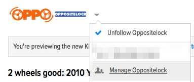
Can you confirm that it's available for you under the drop down above the content rail as opposed to inside the main menu drop down?
|
Gamecat235
> Ernie @ Kinja
02/17/2014 at 12:52 |
|
It's there for me... It took me a while to find it as well. (Also, Show Mom Jeans?)
|
Ernie @ Kinja
> Gamecat235
02/17/2014 at 12:57 |
|
I hear you, though surprisingly the amount of complaints regarding the removal of non-recommended images on mobile has been next to none. ttyy has been the loudest bemoaner of the "feature" to date.
|
Gamecat235
> Ernie @ Kinja
02/17/2014 at 13:03 |
|
Well, to be fair, I do wonder if slow adoption rates to the beta version, which can't really be used to comment with, is the reason for not much feedback. I like to think I'm a relatively heavy mobile user (multiple sessions every day from my iPhone), but I do worry that a gimped mobile version will lead me to actually be more productive when I'm away from a computer (this was secretly your plan, wasn't it??).
And I haven't used the mobile version of 1.2 other than my ill fated communication attempt with Mr Denton over on Product (black on black) and then tests to see if the issue was still around (last I checked, it was).
|
Ernie @ Kinja
> Ernie @ Kinja
02/17/2014 at 13:10 |
|
Ehhh, you don't need to pay attention to that. ;)
|
Ernie @ Kinja
> Gamecat235
02/17/2014 at 13:12 |
|
Black on black should be fixed.
Also, let's be honest, we want to keep you on our sites at the expense of your personal work or life!
|
Tom McParland
> Ernie @ Kinja
02/17/2014 at 16:56 |
|
Ernie,
Sorry for the late response I just got back in a computer. I do see that feature on my browser. However I do not seem to be able to access it via mobile. Speaking of mobile, when I open a "response" window in like I have done here on mobile the box is black so I can't see anything I type!
So it looks like the Raptors figured out how to open doors. :D
|
Ernie @ Kinja
> Tom McParland
02/17/2014 at 17:17 |
|
It's not available on mobile right now - that's a bug. We're going to get it added in there soon!
|
Gamecat235
> Ernie @ Kinja
02/18/2014 at 11:34 |
|
That's the best superuser tool name ever. I'm imagining a few things that would be representative of, and personally, being rather hard to offend, I'm pretty amused.
|
Gamecat235
> ttyymmnn
02/18/2014 at 11:51 |
|
Aesthetics:
The primary blog logo has been reduced in size to something like (ratio)x40px instead of the previous method which was I believe 300x(ratio). Finding the new ratio for optimal size is doable, but will require everyone to reconfigure their logos.
White is great, very contrasting, some of the quoted elements seem to be on gray background, could the shade of grey for this be slightly lighter so as to preserve the contrast?
I'm still adjusting to the navigation of comments. Is it my imagination or has the "View All ### Replies" functionality changed slightly since the preview began (actually, it seems like it has behaved slightly differently multiple times).
Why do I see the comments loading animation at the bottom of the comment section when all comments are loaded?
|
ttyymmnn
> Gamecat235
02/18/2014 at 12:14 |
|
If you've figured out how to navigate comments, please do share.
|
Gamecat235
> ttyymmnn
02/18/2014 at 12:22 |
|
Still a work in progress. I generally go the view all replies and then go from there. It's easier and it seems to work best (as they continuously tweak the display methods).
 orcim
> ttyymmnn
orcim
> ttyymmnn
02/18/2014 at 21:52 |
|
I just had the experience of looking at a popular post, but not agreeing with it. I could comment, but that's either grey, or dismissed. What about a non-recommend button?
|
Gamecat235
> ttyymmnn
02/25/2014 at 11:15 |
|
Sorry, you'll get some additional notifications today, but this was the most central post for collecting feedback...
 Victorious Secret
> ttyymmnn
Victorious Secret
> ttyymmnn
02/25/2014 at 11:17 |
|
Your request for no bitching is going to fall on deaf ears.
|
ttyymmnn
> Gamecat235
02/25/2014 at 11:25 |
|
No problem.
|
ttyymmnn
> Victorious Secret
02/25/2014 at 11:26 |
|
Most likely. Unfortunately, those deaf ears are at Gawker.
 Nibbles
> ttyymmnn
Nibbles
> ttyymmnn
02/25/2014 at 15:03 |
|
mkbruin isn't the only one. My previous issues with Kinja on Windows Phone have only been exacerbated on 1.2. Since 95% of my time is spent mobile (I don't actually own a computer any more) this makes continuing to contribute to Gawker spaces incredibly hard. Incredibly may not be a strong enough word - so jaw-bustingly painful I am about to give up entirely. I can't do everything while I'm on my work computer, nor do I want to.
|
ttyymmnn
> Ernie @ Kinja
02/25/2014 at 15:11 |
|
Here's a reply from today's bump of this thread. I don't know what is specifically wrong, though.
!!! UNKNOWN CONTENT TYPE !!!
mkbruin isn't the only one. My previous issues with Kinja on Windows Phone have only been exacerbated on 1.2. Since 95% of my time is spent mobile (I don't actually own a computer any more) this makes continuing to contribute to Gawker spaces incredibly hard. Incredibly may not be a strong enough word - so jaw-bustingly painful I am about to give up entirely. I can't do everything while I'm on my work computer, nor do I want to.
|
Ernie @ Kinja
> ttyymmnn
02/25/2014 at 15:40 |
|
I'm going to reply on his post in the Jalopnik thread.